I have overloaded my current and second scrapbook album with this piece. Sixty 12×12 pieces and counting! Haha! Now I’m just hoping my two faux-leather albums I ordered via Amazon get delivered soon… PROPER DELIVERY! I’m really sick of getting delivery advices from the postal services.
Well, yes! ‘Tis the season!! Something Christmas-y this month; with my all-time favourite trio – Ron Weasley, Harry Potter and Hermione Granger. Miss them so much!

I used Pencil Lines’ Sketch 49 by Jeanette Heardman. Thank god for the chance of using my leftover cardstock. I really hate the amount of scraps I have in my stock. But throwing them away is out of question. What’s the point of “scrap”-booking if you only use new stuff, no?
BRANDS USED
- Japan Home
– (item #3311212) plastic snowflakes- American Crafts
– (item #42743) white foam alphabets
– (item #53191) green chipboard alphabets- Papercraft Inspirations
– felt toppers- VersaMagic
– (item #GD-58) chalk ink: Hint of Pesto- Stabilo
– (item #88/36) green pen- Pilot
– (item #BL-CH-7-W-BG) white pen- Daiso Japan
– (item #31) chalk
– (item #25) border tape
– (item #B-9) beads- Making Memories
– (item #23541) brads- Ek Success
– (item #PSP21C) butterfly puncher- CarlaCraft
– (item #CP-11) corner puncher- Sakura
– (item #LRBP02) lace- Prima
– (item #569921) bird wood veneer
– (item #557164) handmade flowers
– (item #552534) floral embellishments

As usual, I edged the photo with chalk-ink. I used VersaMagic’s ‘Hint of Pesto’ for that. And for the first time ever, I gave the photo some ‘cornering’. Thank Merlin my puncher didn’t fail on me. At times, it’d make ugly cuts. I had to sharpen the puncher using scraps of aluminium foil before use. Anyway, as per the sketch by Jeanette, I wrote the journaling section around the photo… Hmm, I hate my handwriting. *pouts*

YES!! Finally I’ve used up my last plastic snowflake that I got two years ago. Cleaned up the fake snow before gluing it as the first layer of this section. And ooh! A wood veneer! I love wood veneers! Wish my Cricut machine is strong enough to cut thin pieces of wood. Even with the strongest blade I’ve got, it’s just not strong enough.
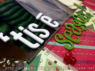
I was most irritated when I realised all my red alphabet sets had missing alphabets that I needed. Hence the reason why I ended up with green and white for the title. Still disappointed I couldn’t have a red title. It would have stood out more. Again, I get frustrated after realising that I forgot to chalk the back of the word, “season”. I had to succumb to dotting the background with white pen to imitate some snow. Even then, it’s almost invisible. And yeah, I glued 3 red beads to represent some winter berries.
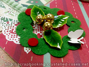
How I wish I had some mini wreath in my stock. I had this felt die-cut that I got from my PaperCraft magazine that I got some time ago. Embellished it with my leftover mistletoe and a paper butterfly.

THE TRIO!!!!! Love them! Beautiful job!
LikeLike
Gorgeous layout!! Good job with all the paperworks. You did great. 🙂
LikeLike
This is so gorgeous!! Love the Christmasy green/red theme.
LikeLike